Design pillars
Built on top of our core JavaScript SDK, the React SDK provides an idiomatic way of using SlashID in React apps.
Our goal is to produce SDKs that are not only effective in solving common authentication problems, but also provide a great user & developer experience. Having analyzed hundreds of libraries in the JS ecosystem and decided what we liked & disliked about them, we set our design pillars:
- TypeScript first - All of our client side SDKs are written in TypeScript so the developers can get a helping hand from the compiler
- Server side rendering (SSR) friendly - SDKs should not prevent or obstruct SSR
- Performance - Prefer solutions with the least impact to the application performance. Our SDK is modular and only ships the minimum features necessary for the modules enabled by our customer to reduce load time
- Developer Experience - Support developers by exposing intuitive APIs
- Accessibility (a11y) - Design the UI components with a11y in mind
- Composability - Use the same APIs we expose to our customers to build the higher level components
Features
While the core SDK is stateless, the React SDK will keep track of authentication state for you. We provide the hook useSlashID which gives you access to the current User instance and the functions for logging in & out. Any change to the user value will make the components using the hook render again with the new value.
This hook is fundamental for the two important use cases:
- Brand-focused customers can use this hook to build customized user interfaces (UIs) on top of it
- We will use it internally to build stateful authentication components
This corresponds to the composability design pillar - by offering the low-level API first we empower customers to quickly and easily build their authentication UI, without interfering with their branding & design. With this foundation we can build various abstractions to take the developer experience to the next level. Our control components are a good example of the first step in that direction.
Control components
The first release of the React SDK also includes our first set of control components - <LoggedIn> and <LoggedOut>.
These components will help you conditionally render the UI based on the SDK readiness and the user authentication states. Of course that’s just the start - we’re really excited about what comes next so let’s talk about that briefly.
What’s next
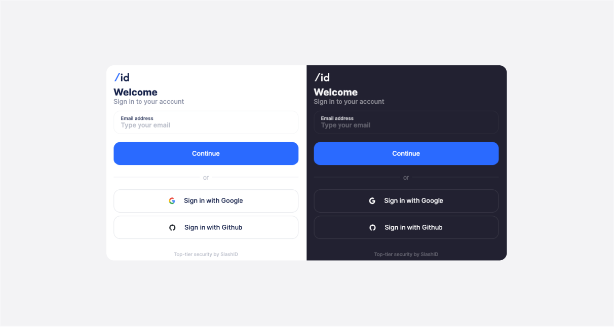
Following our design pillars and especially leaning on the pillar of composability, we’ll continue building our library of control components to act as a basis for the next level - our pre-made, customizable UI components.
Our goal is to implement common authentication and session management use cases as high level UI components. Doing this while adhering to the design pillars is an interesting engineering challenge so stay tuned as we release more blog posts on this topic as we go!


